New in Nuclino: Improved readability and visual design

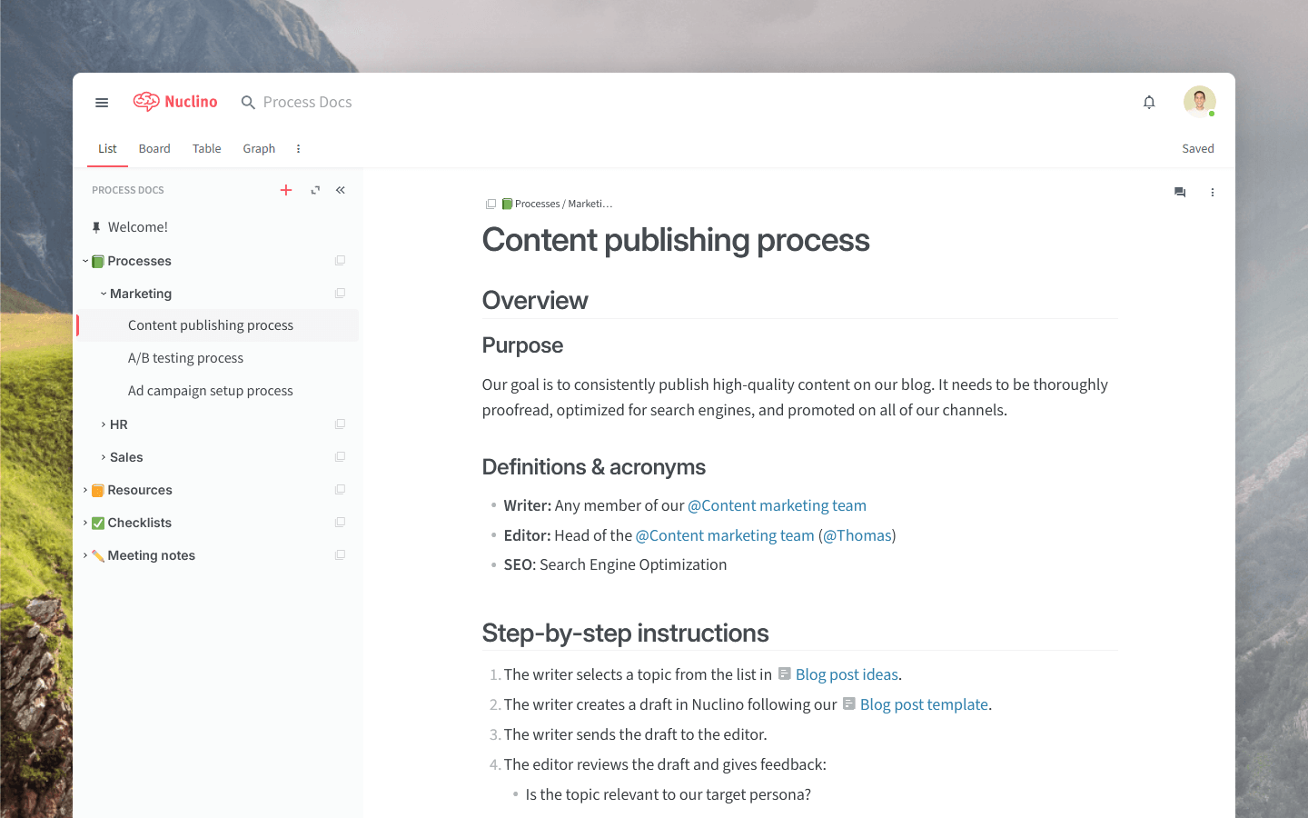
Nuclino has a fresh new look! We've been listening to your feedback and made many subtle changes to make things easier to read and nicer to look at.
Here’s a quick rundown of what’s new.
Improved readability
Bolder headings
We've made the item titles and headings bolder, clearer, and more prominent. Now they stand out more from the rest of your content, making it easier to skim through long items and quickly find what you need.

Improved list spacing
We’ve tweaked the spacing for bulleted, numbered, and task lists to make them cleaner and easier to read.
Better contrast
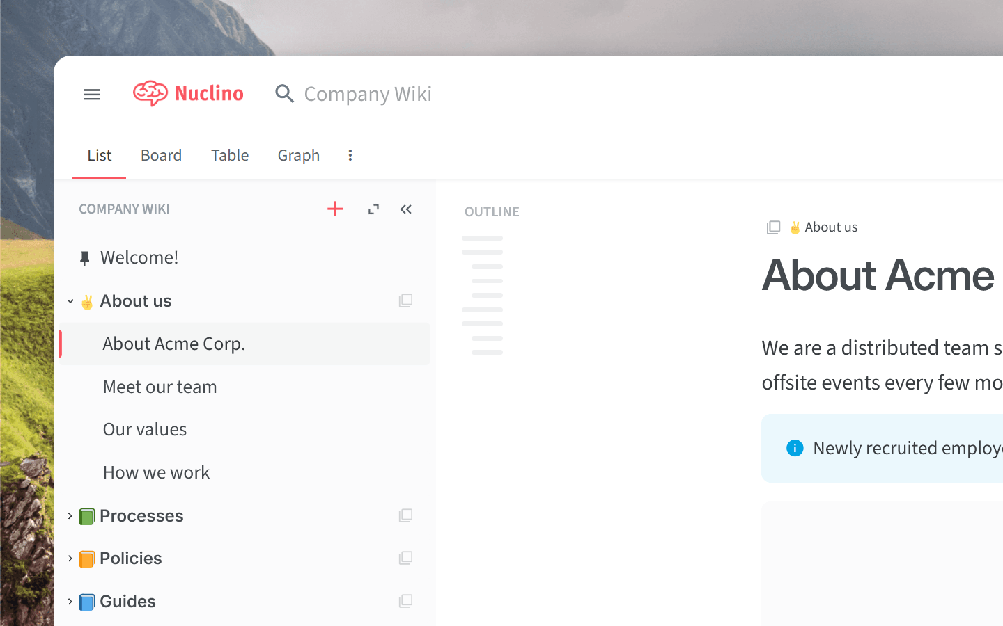
To make things easier on the eyes, we've also adjusted the contrast of several elements, like the item outline and the icons above item titles.
Visual and functional enhancements
Improved list view
For those who often use the list view, we've made several improvements:
The sidebar got a subtle makeover. You may spot a few changes when you select or hover over items and collections.
The list view is now denser, so you can see more items and collections on your screen at once without scrolling.
We've adjusted the typography to make it more balanced.

Smoother interactions
Menus now open and close more smoothly, and switching between items is more seamless. It's a small change, but it can make a big difference in how snappy and responsive Nuclino feels.
Other tweaks and fixes
We improved the styling and positioning of several buttons.
Empty teams, workspaces, and collections now show more useful placeholder information.
Large images with captions are now correctly sized.
...and more!
We hope these updates make your Nuclino experience even better. And as always, we'd love to hear your feedback!