New in Nuclino: Improved navigation and linking experience

The main focus of this update was to simplify and streamline the way you navigate through your docs and projects in Nuclino. Taking your feedback into account, we've implemented a series of improvements to make finding and referencing information easier than ever before.
Improved navigation
The automatic outline, a longstanding feature in Nuclino, got a well-deserved upgrade:
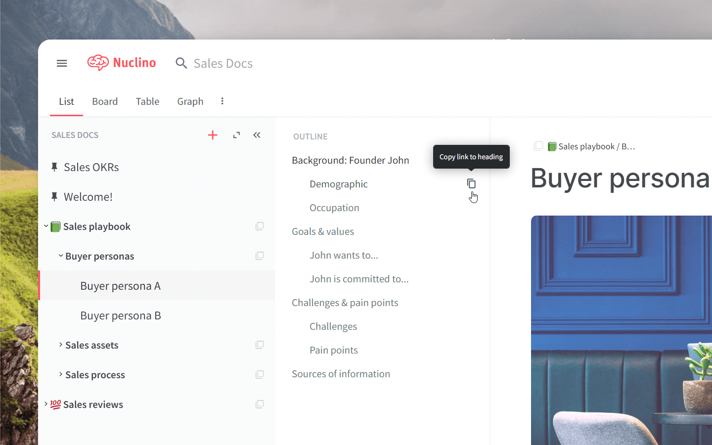
Got a large screen? Now you can utilize this space more effectively and use the outline without having to hide the sidebar.
When you need the outline, hover over it to expand it. When you don't, it will stay out of your way and keep your screen clutter-free.
You can now copy the link to any heading from the outline, so you can easily reference a specific section of an item.
The outline is now easier to read, thanks to several subtle typography adjustments.
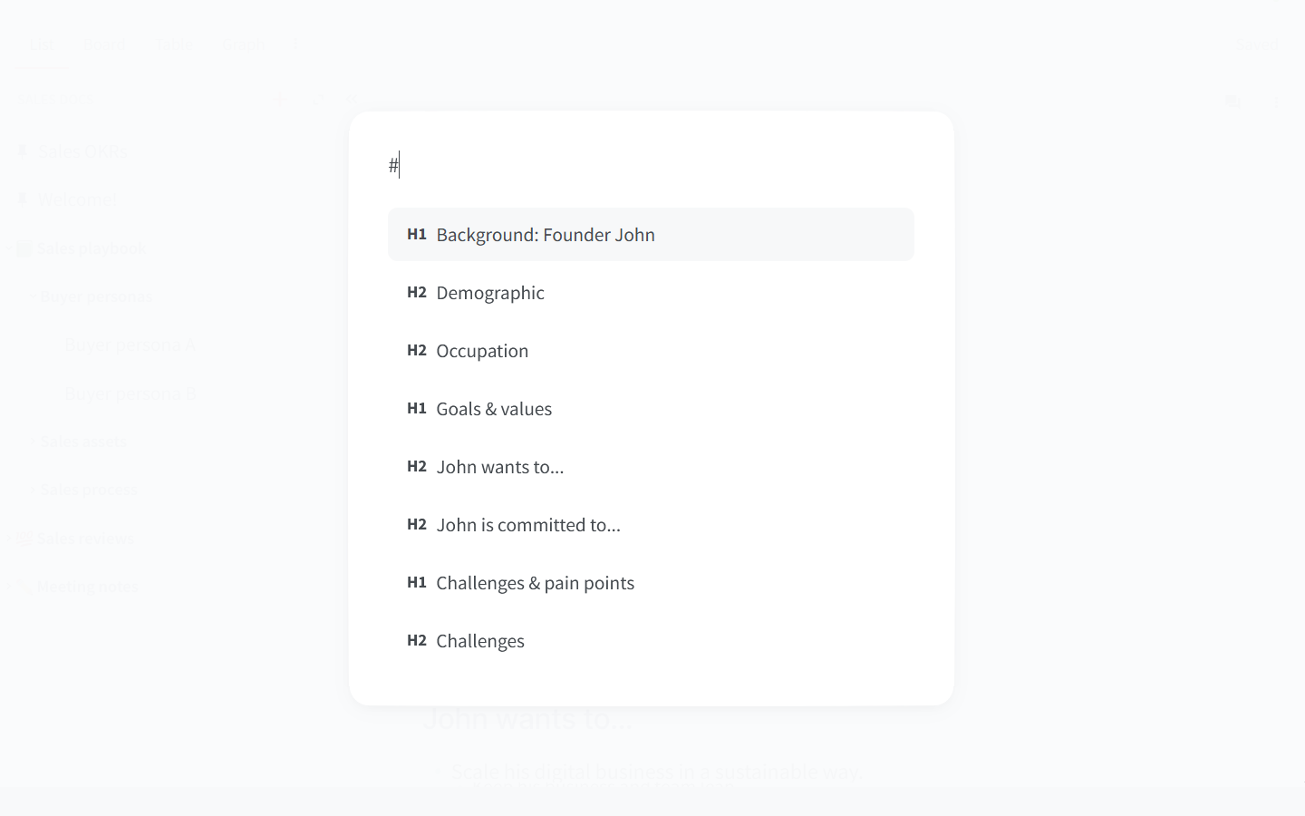
If you prefer to keep your hands on the keyboard, you can now also use the command palette to quickly jump between sections. We've added a new command "Go to heading", as well as a handy shortcut — simply type # and select a heading.

Improved links
Links to headings
Lengthy documents can be overwhelming to navigate, so by popular demand we've introduced a simple yet powerful solution — links to headings. It's a great way to direct someone's attention to a specific section of an item, so they can skip all the scrolling and jump straight to the right spot.
To get the link, select any heading and click Copy link to heading.

You can also copy the link from the outline:

Internal links with custom titles
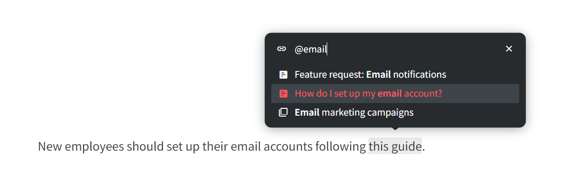
You can easily link to an item or collection by typing @ and selecting the item you need — but the default title is not always a good fit.
Now, you can add an internal link to any text in Nuclino. Select the text, choose Link from the menu, then type @ to link to an item or collection, or # to link to a heading in the currently open item — no need to manually copy and paste the URL.

Easier link editing
Editing existing links and titles also got easier — just click on the link and click Edit:

Other small but impactful changes
It's often the details that define the entire experience. Here are some of the improvements we've released since our last update:
Navigating items now feels much smoother thanks to improved scrolling.
We optimized the performance of items with a large number of headings, resulting in improved responsiveness.
We refined the design and user experience of tooltips and menus across the app.
Items and collections now have distinctive icons.
Hovering over options in the text formatting menu now reveals helpful hotkeys.
Moving items between workspaces will now keep the fields whose type and name are the same in both workspaces.
We have improved the billing management experience.