Less is more: Don't let formatting distract you from your ideas

We are conditioned to think more is better. More features and options in a software package seem instinctively more appealing and desirable. The paradox is that while we are attracted to a large number of choices and capabilities, they are what ends up distracting us and destroying our productivity. To make the most out of the tools we are using, we need to overcome our natural urge to complicate.
The complexity of simplicity
“Simplicity is the ultimate sophistication.”
– Leonardo da Vinci
There is a beautiful elegance to simplicity. According to the Occam's Razor, a design principle dating back to the work of Aristotle, "it is futile to do with more things that which can be done with fewer". In layman's terms, all things being equal, the simplest solution is often the best. Known also as the principle of parsimony, it encourages us to eliminate unnecessary elements that would decrease a design's efficiency, without compromising on core functionality.
Yet simplifying is often far from simple. Distilling a simple solution from a complicated one takes more than uncluttering of the interface and removal of redundant features. A design can be sleek, elegant, and simple, yet unintuitive and frustrating to interact with. Simplicity is, therefore, nothing without usability.
Modern collaboration tools: capability vs. usability
The trade-off between functionality and ease of use is very prominent when it comes to UX/UI design. Many software developers fail to resist the temptation to complicate, adding more and more marginally useful features and elements to a product. This is particularly true for modern collaboration and content management tools.
How many times have you struggled to write your thoughts down and found an escape by fiddling with the fonts and formatting options for way longer than necessary? Don't rush to blame yourself, however, when your tools are not setting you up for success.
We all think we want more formatting features and options when we don’t truly need them. They quickly clutter up space both on our screens and in our decision-making process. To really get things done, most of us need to go into a "do not disturb" mode, and more features mean more decisions, wasting your creative energy and distracting you from what matters.
This is where so many collaboration tools get in the way of creating great content, accumulating unnecessary features in an unintuitive layout that doesn't reflect the way teams create and collaborate in real life.
Substance over style
We aim to design Nuclino to be a clean, distraction-free virtual workspace.
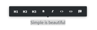
When you only have a few essential formatting options to emphasize your content— bold, italics, or headings — the overall structure becomes transparent and consistent among all team members. Additionally, the Nuclino editor supports markdown commands which are a set of simple keyboard shortcuts to help you format content in the fastest way possible. A table of contents is automatically created for you based on your headings, giving you and your team a clear overview of your content.
Not all formatting features are superfluous and only there to distract you, of course. A well-formatted document gives your content structure and helps you communicate your message to your team members in a clear way. And while it may be tempting to play around with colorful font choices, creative page layouts, and customized bullet styles to give the document a touch of your personal style, don't let it slow yourself down. Keep formatting simple and functional and let it convey what matters— your ideas— rather than your font and color preferences.