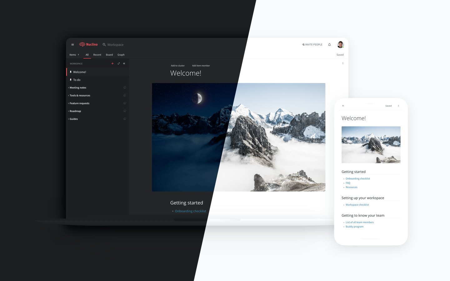
Introducing Nuclino dark mode

Nuclino has become known for its clean white and red (okay, mostly white) design. It's loved by many of our users and is one of the things that make us stand out – but it's not everyone's cup of tea:

Now, for all of you night owls out there, Nuclino is finally going dark! 🌒
Today we have released one of our most highly requested features – the Dark Mode. We revamped every color, icon, and font in the app and added a lot of other subtle tweaks to the interface.
To go dark, simply click on your profile picture and use the “Dark mode” toggle:

Whether you want to give your eyes a break or you just want to change things up a bit, give it a try!
In addition, we listened to your feedback and implemented multiple enhancements to the typography and the color scheme of the default theme. These changes should improve the readability and create a more delightful experience overall – check it out and let us know what you think! 😎