Bike sheds and ducks, or why most design review meetings are time wasters

When it comes to the way different designers and their teams work together and the processes they adopt, there is no one-size-fits-all. Every product is different, and every team has different constraints including team size, location (co-located or distributed), company type, and the overall seniority of the team.
What most teams have in common, however, are design review meetings – group discussions between designers, engineers, and other stakeholders with the ultimate goal of improving a presented design. And while meetings in general are lamented as a soul-sucking waste of time, design review meetings tend to stand out since they are ground zero for Parkinson's Law of Triviality, otherwise known as bike-shedding.
“Bike-shedding” (aka the Law of Triviality)
“Half the world is composed of people who have something to say and can’t, and the other half who have nothing to say and keep on saying it.”
—Robert Frost
In 1957, Cyril Northcote Parkinson – the Dilbert of his day – defined the Law of Triviality, according to which the amount of discussion surrounding a change is inversely proportional to the complexity of that change.
He gives the example of a fictional committee discussing a £10M nuclear reactor, a £350 bike shed, and a £21 coffee fund. The concept of a nuclear reactor is so enormous and complex that not many members feel confident enough to venture an opinion and the decision is quickly made.
On the other hand, a bike-shed is easy to grasp, so they spend hours on that topic. After lengthy debate, the committee defers the coffee fund decision to the next meeting.
.png)
This gave rise to the term “bike-shedding” in software development and design, where feedback exchange is an integral part of the process.
Why do we engage in bike-shedding?
There are many understandable reasons why bike-shedding is such a pervasive problem in meetings.
It makes it easy to display competence (over something trivial).
You can point to your input (that added little value).
It's an ego-boost, because others listen to you (when you should be listening).
You can claim momentum (for an unimportant change).
It's akin to focusing on a debate opponent's spelling or grammar instead of his arguments. By speaking up about complicated, important problems we run the risk of saying something stupid and embarrassing ourselves. But we still want to feel and appear as if we're making a contribution, so we weigh in on the trivial stuff instead. And it’s as if we wouldn’t be getting our money’s worth out of our time if everything about the design was great.
“What’s the point of having a meeting if there isn’t something to change?”

Nitpicking is natural. We all do it, it's an instinctive escape route when we are presented with a complex problem and asked for feedback on the spot. But it's also true that it makes most design review meetings a waste of everyone's time – and it doesn't need to be this way.
You can't always “add a duck”
One effective (but counter-productive) approach to combat bike-shedding is to “add a duck” to your design.
Jeff Atwood of Stack Exchange defined a duck as a feature or design element “added for no other reason than to draw management attention and be removed, thus avoiding unnecessary changes in other aspects of the product.”
The tactic originated from a story out of Interplay Entertainment, a software company developing an animated chess game Battle Chess, where one of the designers was tired of all the superficial changes his stakeholders wanted.

To solve this problem, when he created the character of the queen and the animations exactly as he wanted them to be, but also gave her a pet duck. He made sure the duck was obnoxious and overdone, annoyingly flapping around on the screen – while at the same time being careful not to disturb the Queen. According to the Coding Horror blog, “Eventually, it came time for the producer to review the animation set for the queen. The producer sat down and watched all of the animations. When the animations were done, he turned to the artist and said, “That looks great. Just one thing: get rid of the duck.”
While that is an amusing anecdote – and adding a duck or even purposeful bike-shedding have proven to be useful tactics in certain situations – it's also a colossal waste of time for everyone involved.
Besides, what would you do if they end up liking the duck?
The case for asynchronous design meetings
Avoiding superficial feedback
One of the underlying reasons people resort to bike-shedding is that they need time alone to focus and think about complex problems. Allowing designers and other stakeholders think deeply about the design problem by themselves allows them to produce better and more precise feedback than they could ever do on the spot.
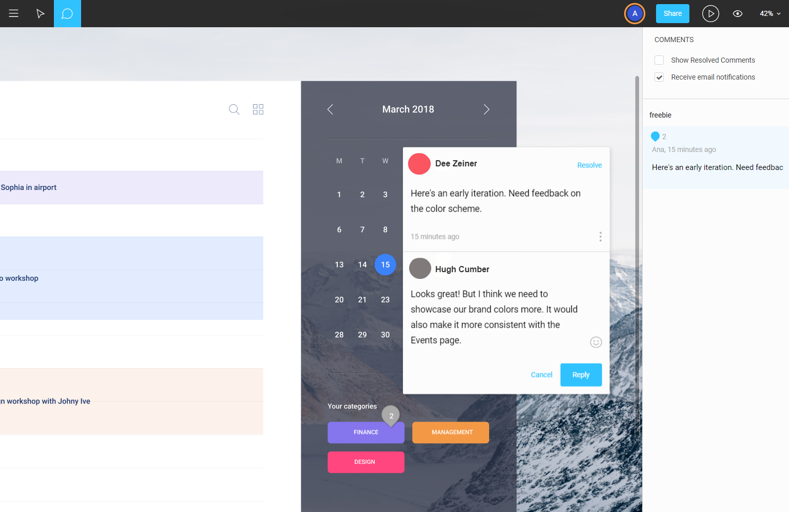
With asynchronous design review meetings that rely on online team collaboration tools, all stakeholders are able to discuss both pixel-level adjustments as well as complex UX flows at their own pace. It's also easier for reviewers to be extra-clear in their feedback since they have more time to think it through and properly write it, instead of improvising and making unhelpful or irrelevant comments just for the sake of saying something.

Preserving a log
Aside from the obvious benefit of being able to document and share feedback in one centralized place, this approach also does a great job of communicating the journey a project has taken by preserving a detailed log of all changes and the reasoning behind them.
Any stakeholder can scroll down the document to go back in time and see how a design has evolved, why certain decisions were made, and who was involved. It can also help onboard the newer team members who can review things and learn about the product at their own pace.

Designing across borders
Asynchronous design meetings can be a particularly efficient and inclusive workflow for remote employees. It's easy to underestimate the significance of natural day-to-day conversation that you miss out on by not sharing the same physical space.
If you have remote employees on your team, it becomes your job to create a process that keeps everyone on the same page. Video calls are one popular solution, but virtual meetings are as susceptible to bike-shedding as regular ones. Less time wasted in such synchronous meetings allows each designer to contribute at a time that is more convenient for them.
Sometimes, in-person is still better
In the end, all the process and tools and remote culture in the world would never fully replace good ol’ fashioned face-to-face interaction. But it's important to make the time we spend in meetings count.
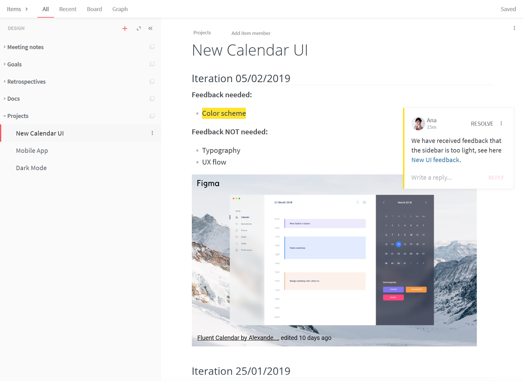
The best way to achieve that is to be crystal clear about the type of feedback you want to receive. Specify upfront the design aspect you want to address and limit the discussion to that problem. “I just want to review the color scheme” or “I want to discuss the UX flow”. It may also not be obvious to others if you are presenting the final solution or the first iteration – clarifying it from the start can prevent the confusion.
Creative professionals need long stretches of uninterrupted time to get meaningful work done, and bike-shedding is only one item on the long list of things that make meetings so disruptive and costly to your business. Thus, it makes sense to make async communication the default. Call a meeting only when all other channels of communication aren't suitable for a specific issue.